
rockwell
typography i
Course: gdes 116 | Instructor: Cate roman | Spring 2019
This course is an introduction to the fundamentals of typography, including its theory, practice, technology and history. Emphasis is on the study and practice of typographic
vocabulary, anatomy, proportion, grids, hierarchy and legibility in type applications. Students will analyze typographic solutions and their impact on visual communication messaging

Rockwell anatomy poster
The Rockwell typeface that the world knows today is a slab serif typeface, also known as Egyptian serif. According to the Typedia website, Rockwell was originally produced by the Inland type foundry in 1910, and then “American Type Founders revived the face in the 1920s, with Morris Fuller Benton cutting several new weights”. Then the Monotype Corporation, in 1934, adopted the typeface and made their own version of the typeface that is being used today. Monotype Corporation has at least forty nine typefaces that they created. Bembo, Blado, and Bodoni are some of the typefaces that the corporation originated. According to Joep Pohlen, in his book Letter Fountain, Frank Hinman Pierpont was the head of the design group in Monotype Corporation who designed Rockwell, (327). Pierpont helped design at least four more typefaces other than Rockwell. Imprint, Plantin, Horley Oldstyle, Monotype Grotesque, and Bembo as well. Pierpont was born in New Haven, Connecticut, and he was trained to be a mechanic and moved to Berlin in 1894 to work as a mechanic. According to Identityfont, in 1896 Pierpont “became director of Typograph GmbH in Berlin, manufacturers of a typesetting machine. In 1899 he moved to England and became foundry manager at Monotype. He died in London in 1937”.

Rockwell letters


abstract Rockwell letters
Rockwell has many unique characteristics in its serifs and it’s shape that are different than the normal serifs. It has a unique apex of the capital “A”, as it is monotype, and the “serifs have the same thickness as the other lines and there is almost no thick-thin contrast” (Pohlen 327). The serifs do not change in shape or thickness, like most serif typefaces do because the stroke and the serifs are the same weight. Also, the shoulders in the lower case “m”, “n”, and “h” barely change in size, like their strokes and serifs. The capital “Q” has a unique tail. It is curvy and different than the rest of the letters of the typeface. Pohlen also highlights how Rockwell has “a geometric construction”. He goes on and explains how “both the capital “O” and lowercase “o” are almost circular” (327). Bold Rockwell is mainly used for bigger title heads and advertisement. Rockwell was used in different kinds of advertisement around the early 1990s by Art Chantry. One of Chantry’s successful sales fliers for Urban Outfitters was designed with Rockwell, Franklin Gothic and Trade Gothic. According to Stephen J. Eskilson, “the flier is an iconic recreation of the cluttered, poorly designed advertisement over the years past” (377).


word play
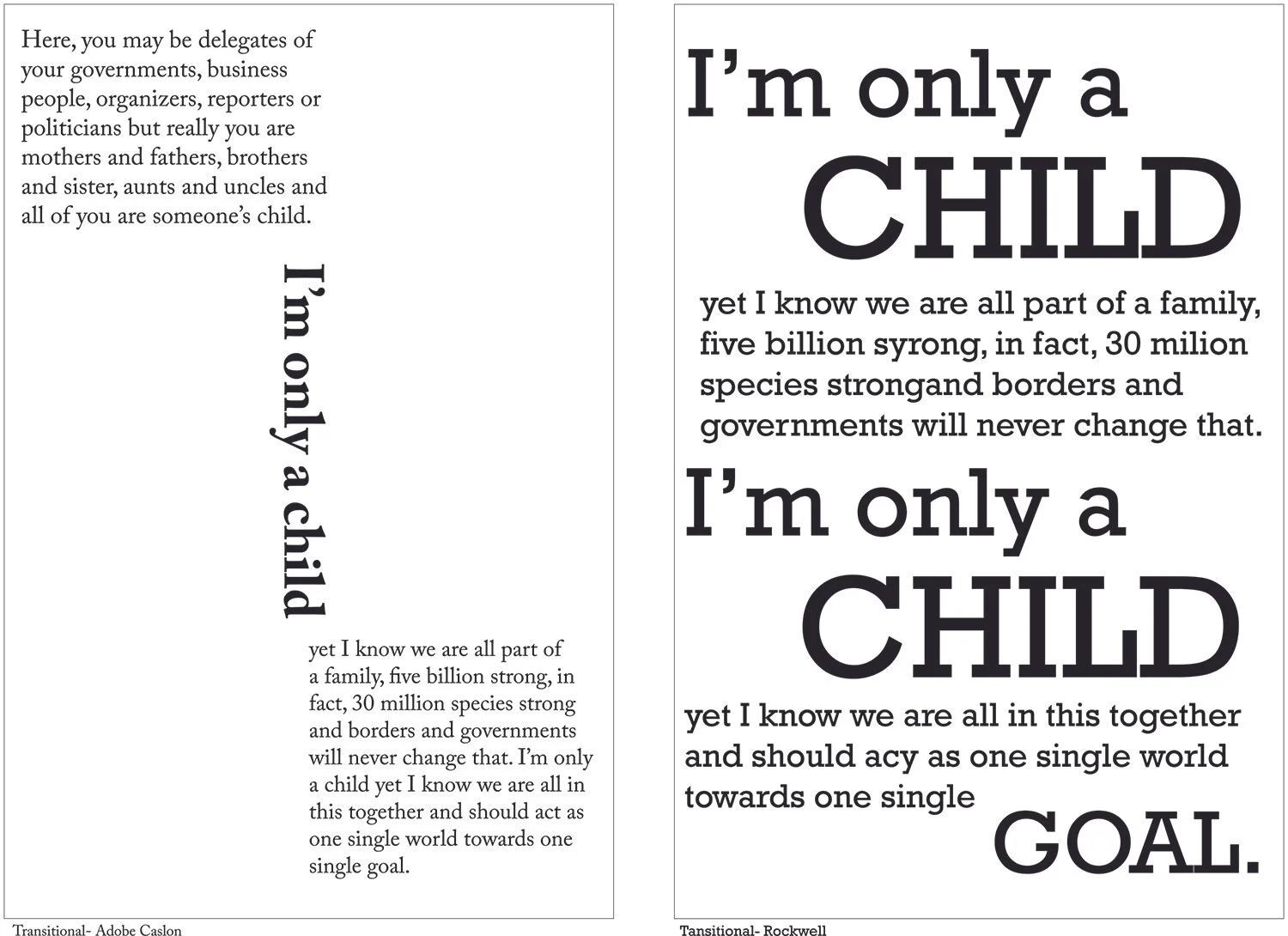
Transitional PARAGRAPHS

EXPERIMENTAL PARAGRAPHS

classical PARAGRAPHS

Fold Grid

fold black and white

fold in color

final fold

Final REVOLUTION poster
Activists in Egypt call for an uprising in their own country, to protest against poverty, unemployment, government corruption and the rule of president Hosni Mubarak, who has been in power for three decades.
The poster has tweets from the 25-January Revolution. People stayed in the square for eighteen days straight. The poster has the most viral tweets from all eighteen days.
The title of the poster is in Century Gothic and the rest of the text is in Century Schoolbook. The description is in regular Century Schoolbook and the rest of the poster is in bold Century Schoolbook.